Overview
SugarMummy is a desktop application tailored for type 2 diabetics to better manage their day-to-day life. Users interact with it using a CLI, and it has a GUI created with JavaFX. It is written in Java and has about 30 kLOC.
Besides being a schedule planner cum reminder app, SugarMummy also supports logging of data such as blood sugar level and BMI. As these data are closely linked to the severity of type 2 diabetes, they can be summarized over a time period and presented in a visually intuitive graphical form. This helps users to track progressions better. Moreover, there are achievements waiting to be unlocked and they serve as extrinsic motivation for users to keep a healthy lifestyle. GUI font color and background are also customizable to fully enhance user experience. The diet aspect is also taken care by SugarMummy which recommends food and snacks beneficial for type 2 diabetics upon request.
Summary of contributions
-
Major enhancement: added the ability to view daily, weekly or monthly average in a graphical form.
-
What it does:
averagecommand allows users to track their daily, weekly or monthly progressions for different record types. Averages are presented in a line graph. Different parts of the graph background are also colored differently to demarcate healthy and unhealthy values. The graph also shows a legend box to describe the color used. -
Justification: Without this feature, user can only track their progression using
listcommand. This requires them to scroll through possibly hundreds and even thousands of records. Due to this infeasibility,averagecommand is introduced. The main part of tracking progression is to see the general trend and this justifies the use of line graph. Lastly, graph demarcations are used because users may not be familiar with the range of healthy and unhealthy values. -
Highlights: The first difficulty encountered when implementing this feature was how to group records from same day, week or month together without using a separate code for each type. The solution can be found in
AverageMap.java. The second difficulty was highlighting graph background with colors. JavaFXLineChartdoes not support such functionality hence I had to implement the functionality throughCustomLineChart.javawhich overrides JavaFXLineChart.
-
-
Code contributed: [Code contribution on Reposense Report]
-
Other contributions:
-
Project management:
-
Managed release
v1.1andv1.3
-
-
Documentation:
-
Removal of unused existing features:
-
Refactor original addressbook to suit SugarMummy (Pull requests #119)
-
-
Contributions to the User Guide
Given below are sections I contributed to the User Guide. They showcase my ability to write documentation targeting end-users. |
DATA SUMMARY/ANALYSIS
Displays the daily/weekly/monthly average of records in a line graph: average
Format: average a/AVERAGE_TYPE rt/RECORD_TYPE [n/COUNT]
AVERAGE_TYPE is either "daily", "weekly" or "monthly".
RECORD_TYPE is either "bloodsugar" or "bmi".
Displays a graph of the "daily", "weekly" or "monthly" average of a particular RECORD_TYPE.
COUNT is an optional field that takes integer between 1 to 12 inclusive.
If COUNT is given, SugarMummy shows up to COUNT most recent number of average values.
Else, COUNT is set to 5 by default and shows 5 most recent average values.
If SugarMummy does not show exactly COUNT number of average values,
that means you do not have enough records in the database. Also, if you enter a field
more than once e.g average a/daily rt/bloodsugar a/weekly, only the last field will be
taken. In the example, weekly average will be calculated instead of daily average.
|
Example usage 1: average a/weekly rt/bloodsugar:
Shows the 5 latest weekly average of blood sugar records.
Example usage 2: average a/daily rt/bmi n/9:
Shows the 9 latest daily average of BMI records.
Summary statistics of a particular record type [coming in v2.0]
Shows minimum, maximum, average of a record type. Categorizes records into low, normal and high values in a pie chart. User can specify the date interval of the summary by giving a start date and end date.
Shows relationship between record types: [coming in v2.0]
User can see how a particular record type changes with other record types. This information will be displayed on a scatter plot where trends can be spotted easily. Note that this feature will work well only if
-
You have records for both record types in any given day.
-
You have more than 50 days worth of records.
Exports summary of all medical records into pdf [coming in v2.0]
Need to share your records with your doctor or others? With SugarMummy export function, you can save any graphs and plots generated in a pdf file.
Contributions to the Developer Guide
Given below are sections I contributed to the Developer Guide. They showcase my ability to write technical documentation and the technical depth of my contributions to the project. |
Data Summary/Analysis feature
Average graph feature: Displays the average values of records in a line graph: average
The average graph shows how the average blood sugar level or BMI of users change over time. Daily, weekly, monthly average are supported.
Implementation
User input to get average graph is parsed by SugarMummyParser which creates a new AverageCommandParser.
AverageCommandParser then parses user input and creates a new AverageCommand. Next, AverageCommand
performs operations on AverageMap in Model with the help from RecordContainsRecordTypePredicate to
filter UniqueRecordList in Model. The result of the execution is returned to Ui as a
CommandResult object and is displayed to the user. In addition, Ui calls and displays average graph
related .fxml file to the user.
The average graph data points generation is implemented by AverageMap and the average values are stored
internally as internalMap. Additionally, it implements the following method:
-
AverageMap#calculateAverage()- calculates and stores the average values needed byAverageCommand. -
AverageMap#asUnmodifiableObservableMap()- returns a read only version ofinternalMap.
These operations are exposed in the Model interface as Model#calculateAverageMap() and
Model#getAverageMap() respectively.
Example Usage Scenario
Below is an example usage scenario and how average graph is created.
Step 1. User launches the application for the first time. The AverageMap will be
initialized and internalMap will be empty.
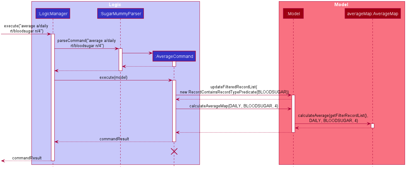
Step 2. User enters average a/daily rt/bloodsugar n/4 in SugarMummy to get daily average blood sugar.
Input is parsed and send to AverageCommand. AverageCommand then calls Model#updateFilteredRecordList()
to filter record list with RecordContainsRecordTypePredicate. This results in a list of
records containing only blood sugar records. Subsequently, AverageCommand calls
Model#calculateAverageMap() to update the internalMap to store 4 most recent daily average values based on the filtered
record list.
The following sequence diagram shows how the average operation works:

The lifeline for AverageCommand should end at the destroy marker (X) but due to a limitation of
PlantUML, the lifeline reaches the end of diagram.
|
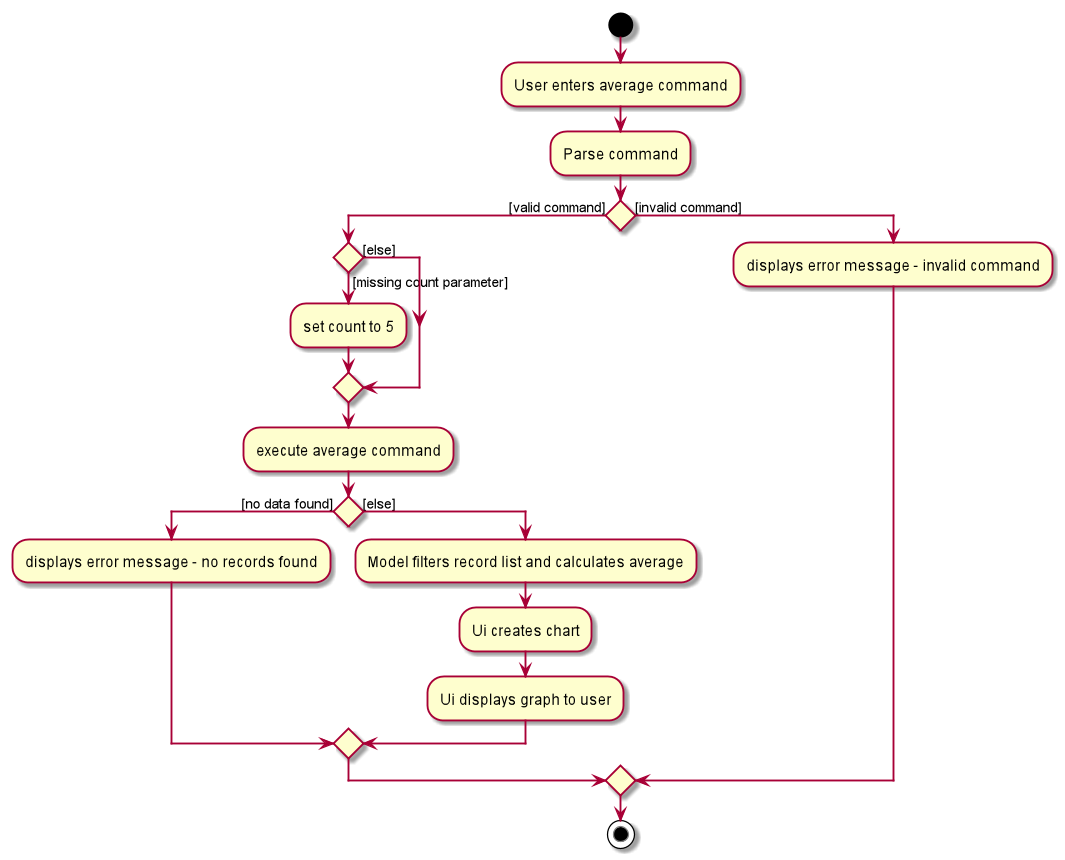
Step 2a. If the user enters average a/daily rt/bloodsugar n/4 and there is no data available,
then the command will fail to execute and throw a CommandException. Alternatively, if user enters
an invalid command, a ParseException will be thrown.
This is illustrated in the activity diagram below.

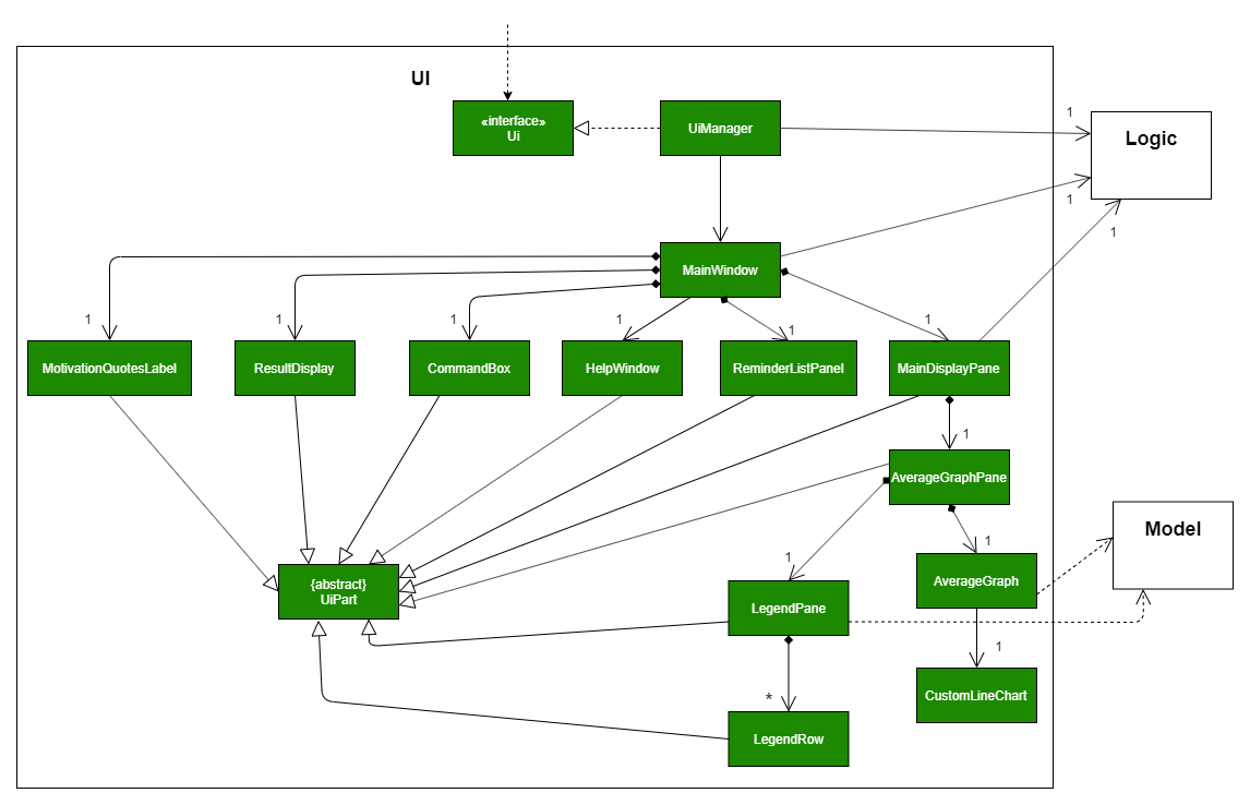
Step 3. Ui receives average CommandResult from LogicManager and creates a new AverageGraphPane
as well as all other necessary components (see below). Ui then displays the AverageGraphPane to
user.
Average graph Ui consists of several parts:
-
AverageGraphPane: Placeholder forAverageGraphandLegendPane. -
AverageGraph: Contains the average graph. Data points are generated byinternalMap. -
CustomLineChart: The implementation for average graph which extends and override JavaFxLineChart. -
LegendPane: Placeholder forLegendRow. This is the legend box for average graph. -
LegendRow: Consists of a colored legend symbol and its description.

Aspect: How to display average graph to user.
The dilemma arises because users, especially recently diagnosed type 2 diabetics, do not know the normal range of BMI and blood sugar level. An intuitive and aesthetically pleasing method is needed to convey this information to user.
-
Alternative 1: Use JavaFx
LineChartto display the average graph and display the ranges below the graph using JavaFxLabel.-
Pros: Do not need to implement anything.
-
Cons: User need to trace data points to the y axis to find it’s value and compare it with the ranges given below the graph. This can be annoying and tedious for the user.
-
-
Alternative 2 (current choice): Override JavaFx
LineChartby adding horizontal range markers to the graph and color the area between the markers.-
Pros: User is able to tell which range a particular data point falls in immediately.
-
Cons: Need to implement horizontal range markers and lay it out on the graph. In addition, a custom legend box is needed to label the horizontal range markers.
-
Data Summary/Analysis Feature coming in v2.0
[Proposed] Summary statistics of a particular record type [coming in v2.0]
The implementation will be similar to average graph feature. The UniqueRecordList can be filtered
the same way as average graph feature to get a list containing only the specified record type.
If only records from a certain time period is needed, a new date predicate class needs to be created
to further filter the UniqueRecordList by starting and ending date. Using the filtered record list,
count the number of low, normal and high values based on some threshold set by the developer. These
counts will then be displayed using JavaFX PieChart. Also calculate the minimum, maximum and average of the
filtered record list. These 3 statistics will be displayed right under the pie chart as plain text.
[Proposed] Shows relationship between record types: [coming in v2.0]
The implementation will be similar to average graph feature. But now, UniqueRecordList needs to
be filtered so that it only contains the two record types needed. To do this, future developer
need to tweak the current RecordContainsRecordTypePredicate to be able to filter two different record types.
Since SugarMummy only supports two record types now, filtering UniqueRecordList is
redundant. However, this implementation consider the situation that more record types may be added
in the future.
|
Using the filtered record list, pair two different record types from the same day together and this pair
represents a data point. Discard records that cannot be paired. Once the pairing process finishes,
display the points in JavaFX ScatterChart.
[Proposed] Exports summary of all medical records into pdf [coming in v2.0]
This feature can be implemented using PDFBOX libraries or any other existing libraries.
Average Command
-
Prerequisites: There are exactly 7 different days of blood sugar and exactly 7 different days of BMI records.
-
Test case:
average a/daily rt/bloodsugar
Expected: Shows a graph with 5 data points. The dates of the 5 data points are the 5 most recent blood sugar records. -
Test case:
average a/daily rt/bmi n/10
Expected: Since there are only 7 BMI records, the graph will only have 7 data points instead of 10. -
Test case:
average a/yearly rt/bmi n/3
Expected: This is an unsupported average type. An error message is displayed saying
Please enter correct input for a/AVERAGE_TYPE!.
AVERAGE_TYPE is "daily", "weekly" or "monthly" -
Test case:
average a/weekly
Expected: Missing compulsory field rt/RECORD_TYPE. An error message is shown:
Oops! The command you’ve entered appears to be in an invalid format.

average: Shows daily/weekly/monthly average of different record types in a line graph.

Format: average a/AVERAGE_TYPE rt/RECORD_TYPE [n/COUNT]

Example: average a/daily rt/bloodsugar n/5
-
-
Prerequisites: There are exactly 3 distinct weeks of blood sugar records and no BMI records.
-
Test case:
average a/weekly rt/bloodsugar
Expected: Since there are only 3 blood sugar records, the graph will only have 3 data points with dates of the 3 most recent blood sugar records in terms of week. There is not enough records to show 5 data points. -
Test case:
average a/weekly rt/bmi
Expected: Since there are no bmi records, an error message is displayed saying
Sorry! You do not have any BMI record.
-
-
Prerequisites: There are at least 12 distinct months of BMI records and no blood sugar records.
-
Test case:
average a/monthly rt/bmi n/9
Expected: Shows a graph with 9 data points and these points are the average BMI values of the 9 most recent month. -
Test case:
average a/monthly rt/expenses n/3
Expected: This is an unsupported record type. Following error message will be shown:
Please enter correct input for rt/RECORD_TYPE!

RECORD_TYPE is "BLOODSUGAR" or "BMI" -
Test case:
average a/monthly rt/bmi n/13
Expected: COUNT field is out of the range 1 and 12 inclusive. Following error message will be shown:
Please enter correct input for n/COUNT!

COUNT takes integer value between 1 and 12 inclusive. -
Test case:
average a/monthly rt/bmi n/five
Expected: COUNT field only takes integer value. Following error message will be shown:
Please enter correct input for n/COUNT!

COUNT takes integer value between 1 and 12 inclusive.
-